
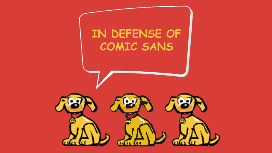
In Defense of Comic Sans
Whether you’re familiar with the world of typography or not, you probably know of the bad rep that Comic Sans has accumulated over the years. The font is childish, ugly, and “a blight on the landscape of typography”, at least according to the founders of the Ban Comic Sans movement. Where did this single-minded hate come from?
Comic Sans was never meant to be taken seriously. The typeface was created to be the voice of a cartoon dog, and as Vincent Connare, the creator of the font said, “Dogs don’t speak in Times New Roman.” Connare wanted the font to be friendly and approachable, with an air of “wonkiness”. It was a font for birthday cards and Beanie Babies. Comic Sans serves the purpose it was created for, and the problem that most people have with it is not with the font itself but with the way people use it. When it’s used in the wrong places, for the wrong reasons, it’s easy to develop a distaste for the typeface.
But the font has applications beyond preschool math worksheets. I write all my essays in Comic Sans. The font is a bit disarming at first, especially after switching over from Arial or something similar, but using it allows the words to flow out without worrying about perfectionism. As Tumblr user alabastermenagerie points out, making a mistake in Bookman feels more like an affront to the art of writing than it does when you make the same mistake in Arial. And making that same mistake in Comic Sans makes it almost inconsequential, allowing you to power through an essay without getting hung up on every little detail. Comic Sans lets you treat your writing like a work-in-progress.
Furthermore, the distinct characters and spacing of Comic Sans caused the British Dyslexia Association to name it one of the most dyslexia-friendly fonts. And in a study about memory done by Princeton University, students retained more information when it was presented to them in Comic Sans, as compared to Times New Roman or Arial.
The hate that Comic Sans receives is unfair and undeserved. When used properly, it’s a font that has much to offer. Try writing your next essay in Comic Sans—you might be surprised at how quickly you finish it. And while you’re at it, find a new font to hate on. May I suggest Papyrus?
Your donation will support the student journalists of Enloe Magnet High School, allowing us to cover our annual website costs. We are extremely grateful for any contribution, big or small!

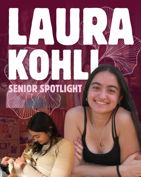
(She/her)
Navya is a senior and the opinion editor of the Eagle's Eye. In her free time, she reads, learns aerial acrobatics, and spends too much...